“A picture is worth a thousand words.”
R doesn’t need to be used only for purely data manipulation and analysis. I had used a number of data visualisation packages in R to help a client with suitable visuals. It not might be as extensive as image editing software such as Photoshop but you could use it to produce quick visuals that could quickly be incorporated into other documents such as annual reports, pamphlets etc.
I have found the emojifont and ggimage R packages to be very useful for producing more engaging visuals that can flexibly embed, respectively, emojis and images into ggplot visuals. Both of these packages have been developed by Guang Chuang Yu. For more information about these packages, take a look at the below links:
emojifont - A package enabling emoji use in both base and ggplot2 systems.
ggimage - A package that supports image files and graphic objects to be visualised in the ggplot2 graphic system.
Another useful R package is the ggforce package that provides even more functionality to ggplot2, e.g. enhancements to annotations. See it for yourself here:
- ggforce - A package that provides more functionality to ggplot2.
Simple tiles with an emoji
Searching for a suitable emoji
Tiles are easy to create to contain a key statistic. I found myself using the emojifont R package which would allow me to incorporate emojis into the visuals I was producing. You can find a quick tutorial on the emojifont package by Guangchuang Yu here.
The first thing we can do is to search for an appropriate emoji. We can find a suitable emoji that relates to “down” (perhaps for a downward trend?) and “dollar” using the emojifont::search_emoji() function like so:
# search for house related emojis
emojifont::search_emoji("down")
##  [1] "upside_down_face"           "-1"
##  [3] "thumbsdown"                 "point_down"
##  [5] "chart_with_downwards_trend" "arrow_double_down"
##  [7] "arrow_down_small"           "arrow_down"
##  [9] "arrow_up_down"              "arrow_heading_down"
## [11] "small_red_triangle_down"
emojifont::search_emoji("dollar")
## [1] "dollar"            "heavy_dollar_sign"
For example, we can show a smiley emoji in an ggplot2 by using the emoji::geom_emoji() function. It’s not too bad!
# example of a smiley emoji plotted using ggplot2
ggplot() +
  emojifont::geom_emoji(alias = "smiley", color = 'steelblue', x = 0, y = 0, size = 100, vjust = 0.4) +
  theme_void()
Putting it altogether
The next thing we want to do is specify the following attributes of the tiles:
The number of tiles we’ll want in the final output
The
xandyposition of the tilesThe height and width of the tiles
I’ve specified two tiles in the below code snippet with predetermined attributes to show some key statistics for the latest Metropolitan Melbourne Market Insights page by (The Real Estate Institute of Victoria Ltd market insights – metropolitan melbourne, n.d.).
# create two simple tiles
key_tiles <- tibble(
  x = c(2, 8.5),
  y = c(6.5, 6.5),
  h = c(4.25, 4.25),
  w = c(6.25, 6.25),
  val = c("-3.5%", "863,855"),
  text = c("Quarterly price change", "Median house price ($)"),
  icon = c(emojifont::emoji('chart_with_downwards_trend'),
            emojifont::emoji('heavy_dollar_sign')),
  color = factor(c(1, 2))
)

# plot two key highlight tiles
ggplot(data = key_tiles,
       aes(x, y, height = h, width = w, label = text)) +
  geom_tile(aes(fill = color)) +
  geom_text(color = "white", fontface = "bold", size = 16, family = "Avenir Next",
            aes(label = val, x = x - 2.9, y = y + 1.5), hjust = 0) +
  geom_text(color = "white", fontface = "bold", size = 6, family = "Avenir Next",
            aes(label = text, x = x - 2.9, y = y - 1.5), hjust = 0) +
  coord_fixed() +
  scale_fill_manual(values = c("#99CCFF", "#FF9999")) +
  geom_text(size = 30,
            aes(label = icon,
                family = "Arial",
                x = x + 1.5, y = y + 0.3),
            alpha = 0.25) +
  theme(plot.margin = unit(c(-0.30,0,0,0), "null")) + # remove margin around plot
  theme_void() +
  labs(caption = "Source: Victorian Insights, The Real Estate Institute of Victoria (REIV)
       Retrieved on 12 September 2020") +
  guides(fill = FALSE)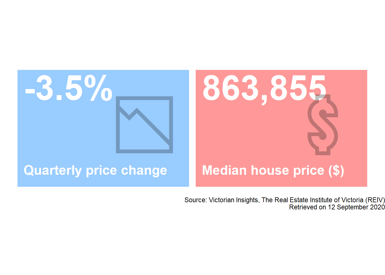
Chart callouts and key highlight
Displaying an image in ggplot2
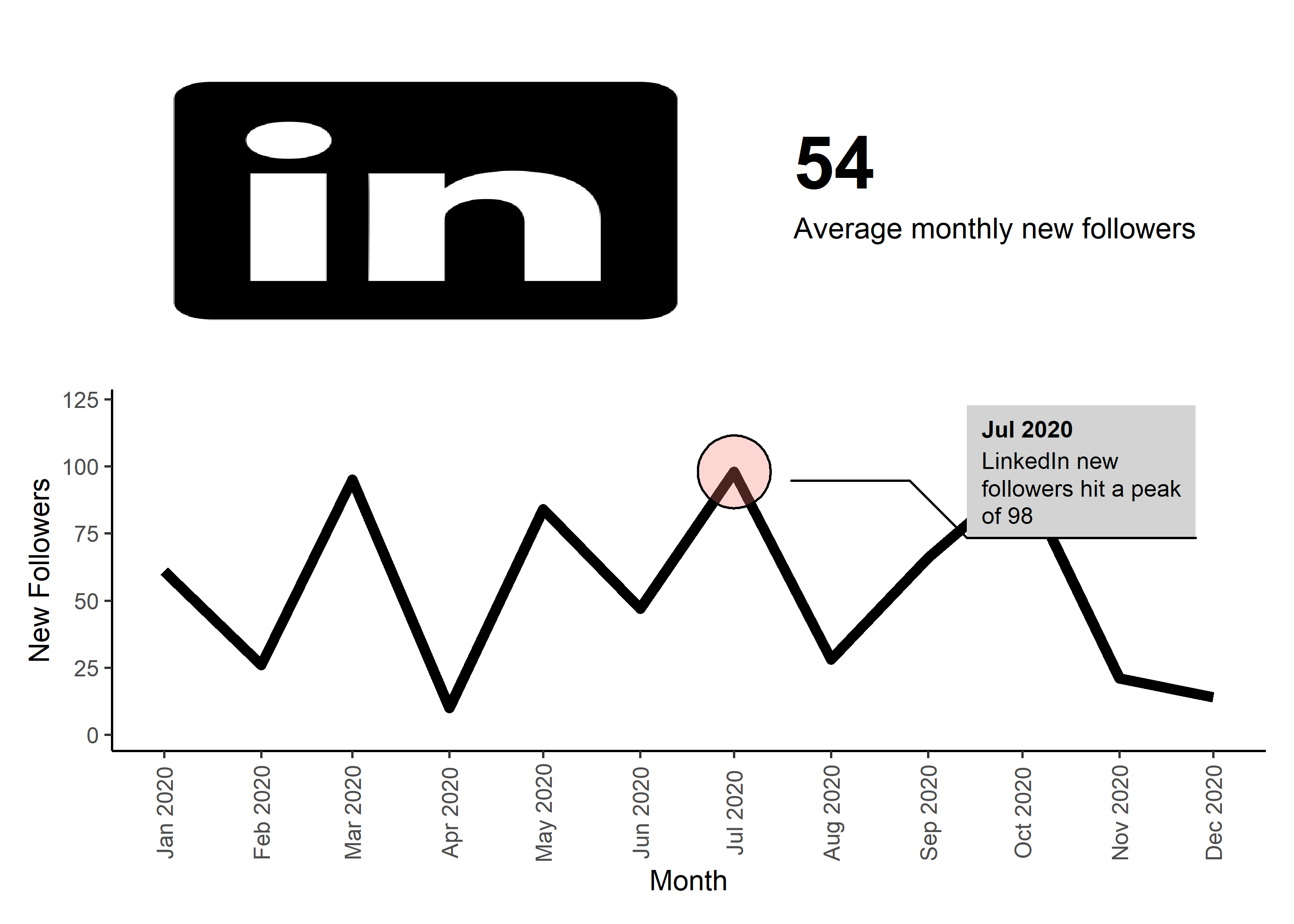
The ggimage R package specifically the geom_image() function allows us to add a geom layer in ggplot2 and visualise an image. I’ve embedded a LinkedIn logo in the following plot. Alternatively, you can even specify an external link to an image to plot too.
At present, I couldn’t find any official documentation on the asp option but this basically controls the aspect ratio of the image. You may need to tweak this to achieve the result you want.
# displaying a LinkedIn
ggplot() +
  ggimage::geom_image(aes(x = 0, y = 0,
                 image = ln_img),
             asp = 1.4,
             size = 0.6) +
  theme_void()
Adding a callout using ggforce
Sometimes callouts can be useful for pointing out key observations in a visual as long as it doesn’t cause unnecessary clutter in the chart. For example, we could add an annotation with a callout for the peak of LinkedIn new followers (dummy data though!). The ggforce::geom_mark_circle() function allows you to annotate a set of points or a single data point.
In the below code snippet, we’ll add a callout for when the highest number of new LinkedIn followers was reached.
# dummy linkedin data
ln_data <- tibble(month_dt = seq(ymd("2020-01-01"), ymd("2020-12-31"), by = "1 month")) %>%
  mutate(ln_new_flrs = sample(1:100, n(), replace = TRUE),
         ln_new_peak = ifelse(ln_new_flrs == max(ln_new_flrs), "Yes", "No"),
         ln_new_peak_label = paste0("LinkedIn new followers hit a peak of ", ln_new_flrs))

# plot line chart of new followers
ggplot(data = ln_data,
       aes(x = month_dt, y = ln_new_flrs)) +
  geom_line(size = 2) +
  scale_color_manual(values = c("#C74943", "#F09649")) +
  theme_classic() +
  scale_x_date(date_breaks = "1 month", date_labels = "%b %Y") +
  theme(axis.text.x = element_text(angle = 90, vjust = 0.5),
        # axis.title = element_blank(),
        legend.position = "none",
        panel.grid.major.y = element_blank()) +
  xlab("Month") +
  ylab("New Followers") +
  ggforce::geom_mark_circle(data = ln_data %>%
                              filter(ln_new_peak == "Yes"),
                            aes(fill = "white",
                                label = format(month_dt, "%b %Y"),
                                description = stringr::str_wrap(ln_new_peak_label, 20),
                                filter = !is.na(ln_new_peak_label)),
                            show.legend = FALSE,
                            label.fill = "lightgrey",
                            label.fontsize = 9,
                            label.family = "Arial",
                            label.buffer = unit(25, 'mm')
  )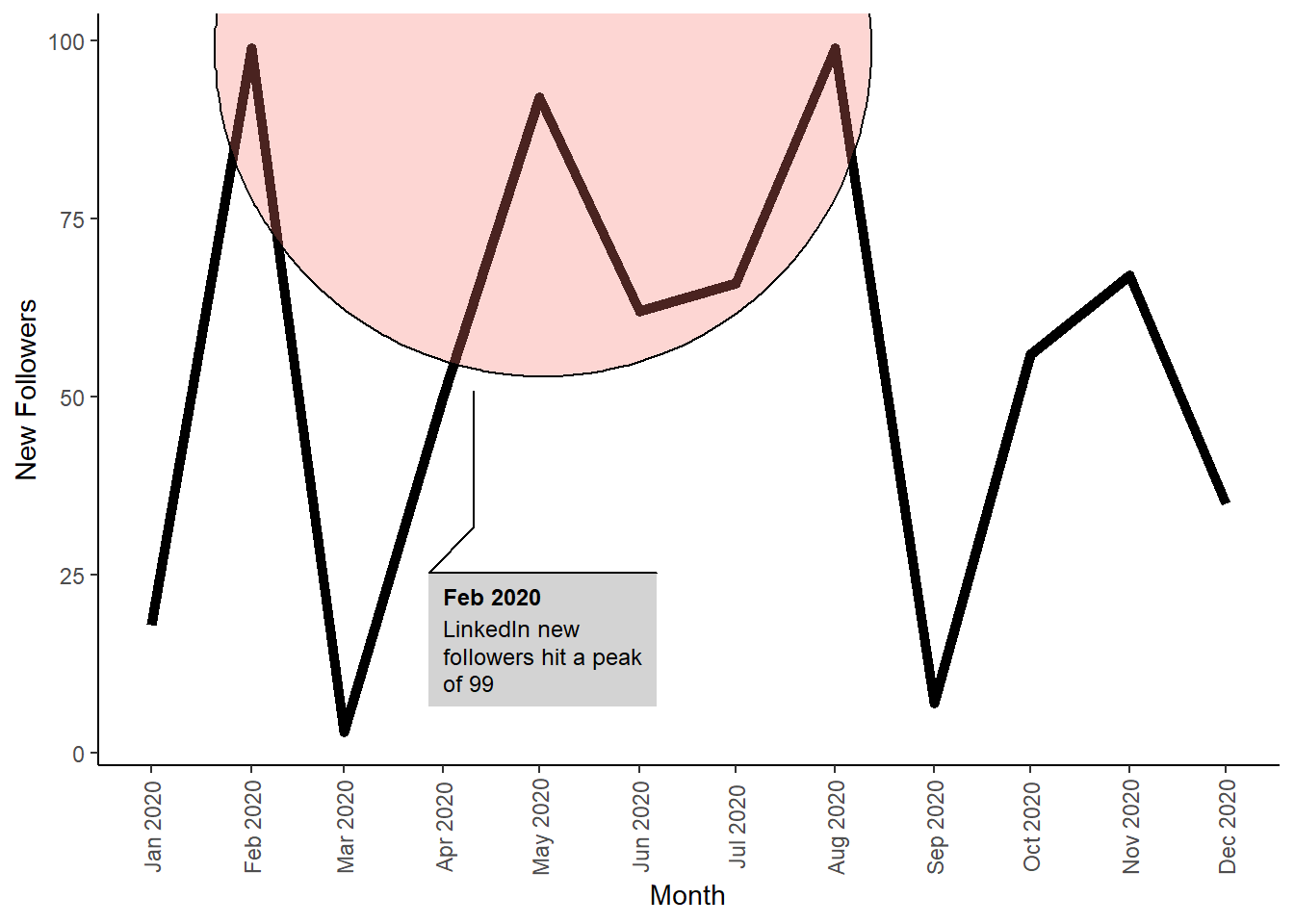
Trend plot and key highlight
Finally, we can put this together to show the following with a little help from the patchwork R package which assists with consolidating plots:
A simple key highlight plot that describes the average monthly new followers; and
A simple line chart that displays the number of monthly new followers with a callout for the peak month.
And there you have it - some niche packages that can assist with designing bespoke visuals that contain emojis, image layers and callouts. Have fun with your visualisation adventures!
References
The Real Estate Institute of Victoria Ltd market insights – metropolitan melbourne. (n.d.). https://reiv.com.au/market-insights/victorian-insights.