Visualisation in research is an important element in distilling the key points of technical information to make it understandable. I love the ggplot2 R package and have used it for research publications but found myself wondering if there were other R packages that could plot statistical results easily. This is where the ggstatsplot R package has made it straight forward to build data visualisations that incorporate results from statistical tests.
Patil (2021) developed this package as an extension of ggplot2. The package can build visualisations from violin plots comparing results between groups/conditions to even correlograms for displaying correlation coefficients between multiple variables. Even better - since it’s developed using ggplot2, you can further modify the aesthetics of the plot as required.
We’ll run through how you can use this amazing R package to efficiently produce a plot with the requisite statistical results for your research.
Load R packages
Go ahead and load the required packages. We’ll use ggstatsplot (for reporting statistical test results in plots), readr (for reading in rectangular data), dplyr (for data manipulation) and ggplot2 (for data visualisation).
# load packages
library(ggstatsplot)
library(readr)
library(dplyr)
library(ggplot2)
Read in the data
I’ve used the Depression, Anxiety, Stress Scales (DASS-42) survey data for this quick tutorial from Open Psychometrics (2019). This contains 42 psychometric items and data on personality and demographic items. There’s a fair amount of data with 39,775 responses available for analysis.
# read in the DASS-42 data
dass_raw <- readr::read_tsv(file = "./data/dass-42-data.csv", col_names = TRUE)
Take a quick look at the data set. You can use the codebook.txt if you want to under what the variables refer to.
# first five records
head(dass_raw)
## # A tibble: 6 x 172
##     Q1A   Q1I   Q1E   Q2A   Q2I   Q2E   Q3A   Q3I   Q3E   Q4A   Q4I   Q4E   Q5A
##   <dbl> <dbl> <dbl> <dbl> <dbl> <dbl> <dbl> <dbl> <dbl> <dbl> <dbl> <dbl> <dbl>
## 1     4    28  3890     4    25  2122     2    16  1944     4     8  2044     4
## 2     4     2  8118     1    36  2890     2    35  4777     3    28  3090     4
## 3     3     7  5784     1    33  4373     4    41  3242     1    13  6470     4
## 4     2    23  5081     3    11  6837     2    37  5521     1    27  4556     3
## 5     2    36  3215     2    13  7731     3     5  4156     4    10  2802     4
## 6     1    18  6116     1    28  3193     2     2 12542     1     8  6150     3
## # ... with 159 more variables: Q5I <dbl>, Q5E <dbl>, Q6A <dbl>, Q6I <dbl>,
## #   Q6E <dbl>, Q7A <dbl>, Q7I <dbl>, Q7E <dbl>, Q8A <dbl>, Q8I <dbl>,
## #   Q8E <dbl>, Q9A <dbl>, Q9I <dbl>, Q9E <dbl>, Q10A <dbl>, Q10I <dbl>,
## #   Q10E <dbl>, Q11A <dbl>, Q11I <dbl>, Q11E <dbl>, Q12A <dbl>, Q12I <dbl>,
## #   Q12E <dbl>, Q13A <dbl>, Q13I <dbl>, Q13E <dbl>, Q14A <dbl>, Q14I <dbl>,
## #   Q14E <dbl>, Q15A <dbl>, Q15I <dbl>, Q15E <dbl>, Q16A <dbl>, Q16I <dbl>,
## #   Q16E <dbl>, Q17A <dbl>, Q17I <dbl>, Q17E <dbl>, Q18A <dbl>, Q18I <dbl>, ...
Transform the data
You’ll need to transform the data so that the Total Depression Score (at the least) is calculated as the raw data doesn’t provide the calculated value. Fortunately, I’ve added that below as depression_total_score.
The data will need to be prepared so that we can fit a linear regression model to see how well our selected predictor variables predict total depression score.
In short:
Our predictor variables will be
genderandmarried(marital status). The outcome variable will bedepression_total_score.Recode the
gendervariable into a factor variable so that “Male” is the reference group.Recode the
marriedvariable into a factor variable so that “Currently married” is the reference group.
# transform data
dass_data <- dass_raw %>%
  mutate(
    depression_total_score = Q3A + Q5A + Q10A + Q13A + Q16A + Q17A + Q21A + Q24A + Q26A + Q31A + Q34A + Q37A + Q38A + Q42A,
    anxiety_total_score = Q2A + Q4A + Q7A + Q9A + Q15A + Q19A + Q20A + Q23A + Q25A + Q28A + Q30A + Q36A + Q40A + Q41A,
    stress_total_score = Q1A + Q6A + Q8A + Q11A + Q12A + Q14A + Q18A + Q22A + Q27A + Q29A + Q32A + Q33A + Q35A + Q39A,
    dass_total_score = depression_total_score + anxiety_total_score + stress_total_score,
    gender = dplyr::recode_factor(gender,
                                  `1` = "Male",
                                  `2` = "Female",
                                  `3` = "Other",
                                  `0` = "Unknown"),
    married = dplyr::recode(married,
                            `2` = "Currently married",
                            `0` = "Unknown",
                            `1` = "Never married",
                            `3` = "Previously married"))
Build a multivariate linear regression model
We’re now ready to build a quick multivariate linear regression model that includes age, gender and married (marital status) as predictor variables to predict depression_total_score. I won’t go into the modelling side of things.
You now have a model stored in mod1.
# create the lm model
mod1 <- lm(formula = depression_total_score ~ age + gender + married,
           data = dass_data)
Let there be plot!
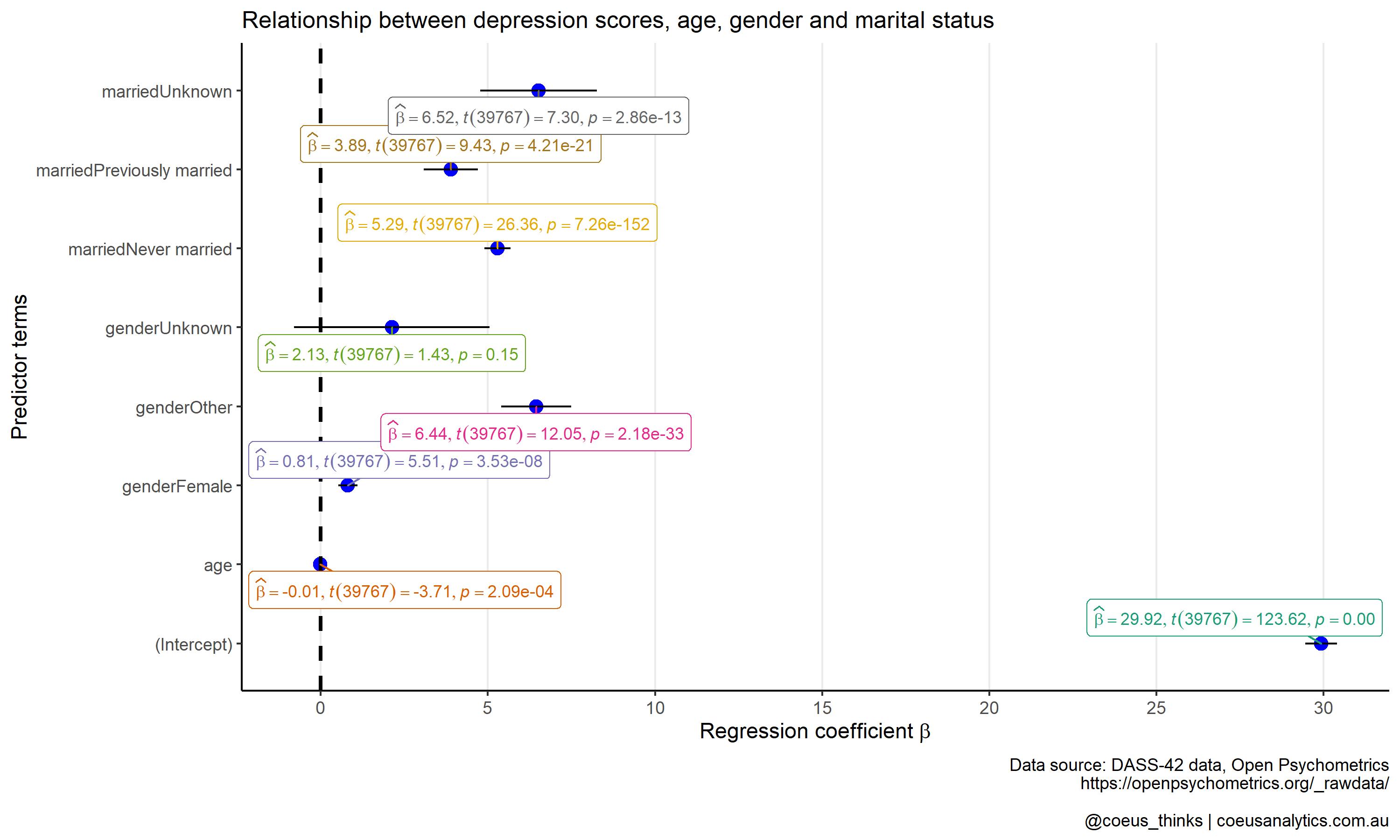
Lastly, the fun part in generating a plot that summarises the regression coefficients from mod1. We can use ggcoefstats() function from the ggstatsplot R package. This will produce a dot-and-whisker plot.
You can see which predictor variables which are potentially strongly predictive of total depression scores. The fact that you can customise it further using standard ggplot2 is brilliant!
p1 <- ggcoefstats(mod1) +
  ggsci::scale_color_lancet() +
  theme_classic() +
  theme(
    panel.grid.major.x = element_line(),
    plot.title = element_text(size = 12)
  ) +
  scale_x_continuous(breaks = seq(0, 30, 5)) +
  xlab(parse(text = "'Regression coefficient' ~italic(beta)")) +
  ylab("Predictor terms") +
  labs(title = "Relationship between depression scores, age, gender and marital status",
       caption = "Data source: DASS-42 data, Open Psychometrics
       https://openpsychometrics.org/_rawdata/

       @coeus_thinks | coeusanalytics.com.au")
p1
Final thoughts
The ggstatsplot package is such a useful package for summarising the results of statistical tests into a digestible plot. There are other helpful functions that can cover other statistical tests. My favourite that I’ve previously used is the ggcorrmat() function that creates a correlogram. I’ve used this for exploratory analysis when wanting to quickly view at a glance the correlations between multiple variables.
You might not be at a stage of producing advanced plots for statistical tests. For those who just want a gentle introduction to R programming, I can help with learning the fundamentals of R. Take a look at our Everyday R: Foundations in R course on offer. The course is aimed to help professionals understand the use of R with real world data sets to run basic data transformations and data analysis activities.
References
Open Psychometrics. (2019). Raw data from online personality tests. Retrieved from https://openpsychometrics.org/_rawdata/
Patil, I. (2021). Visualizations with statistical details: The ’ggstatsplot’ approach. https://doi.org/10.21105/joss.03167